DUTCH BROS
Website Redesign
Overview
This project was created to improve the usability of Dutch Bros' website. Microsoft Excel was used to perform a heuristic evaluation. Microsoft Word was used to write the scenarios and keep track of the responses from the usability test. Microsoft PowerPoint was used to present data analysis and findings from the test. Adobe Photoshop and Canva were used to create the mockups.
The Usability Test
Eight representative participants were gathered to perform the test, both remote and in-person
Each participant was given 4 scenarios consisting of 2-4 tasks each, to perform on the Dutch Bros website
The time, path taken, and completion (pass/fail) of each task were physically recorded by the moderator
The results were summarized and the data was analyzed. Usability issues were found
Usability issues:
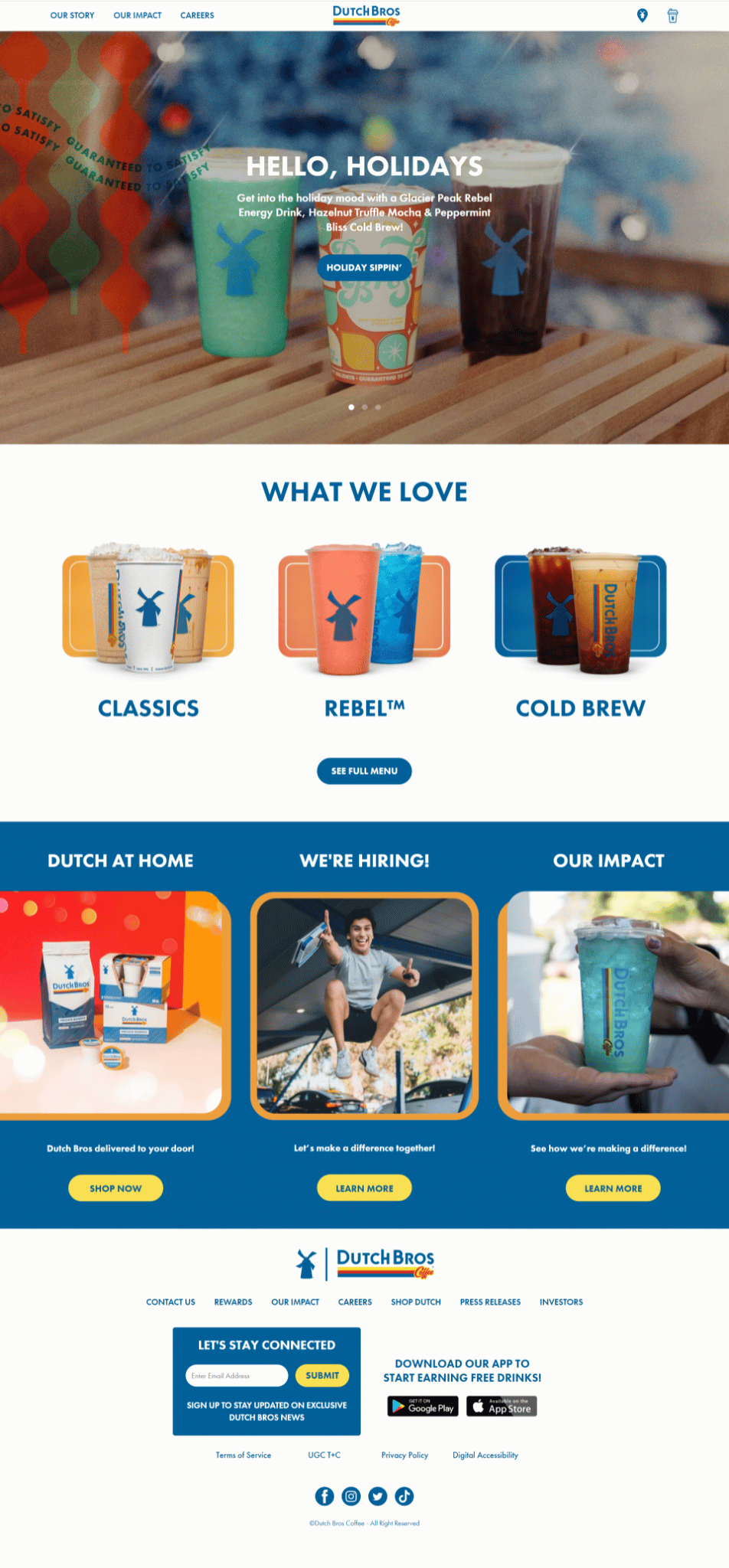
- The links on the left of the top navigation are not relevant, and the icons on the right of the top navigation are confusing (it's not obvious where they lead to)
- There is no search bar on the top navigation, which prevents users from finding what they are looking for faster, like specific drinks and/or ingredients
- The 'Menu' page offers too many options and no filters to narrow them down
- There are no prices listed on the 'Drink' page
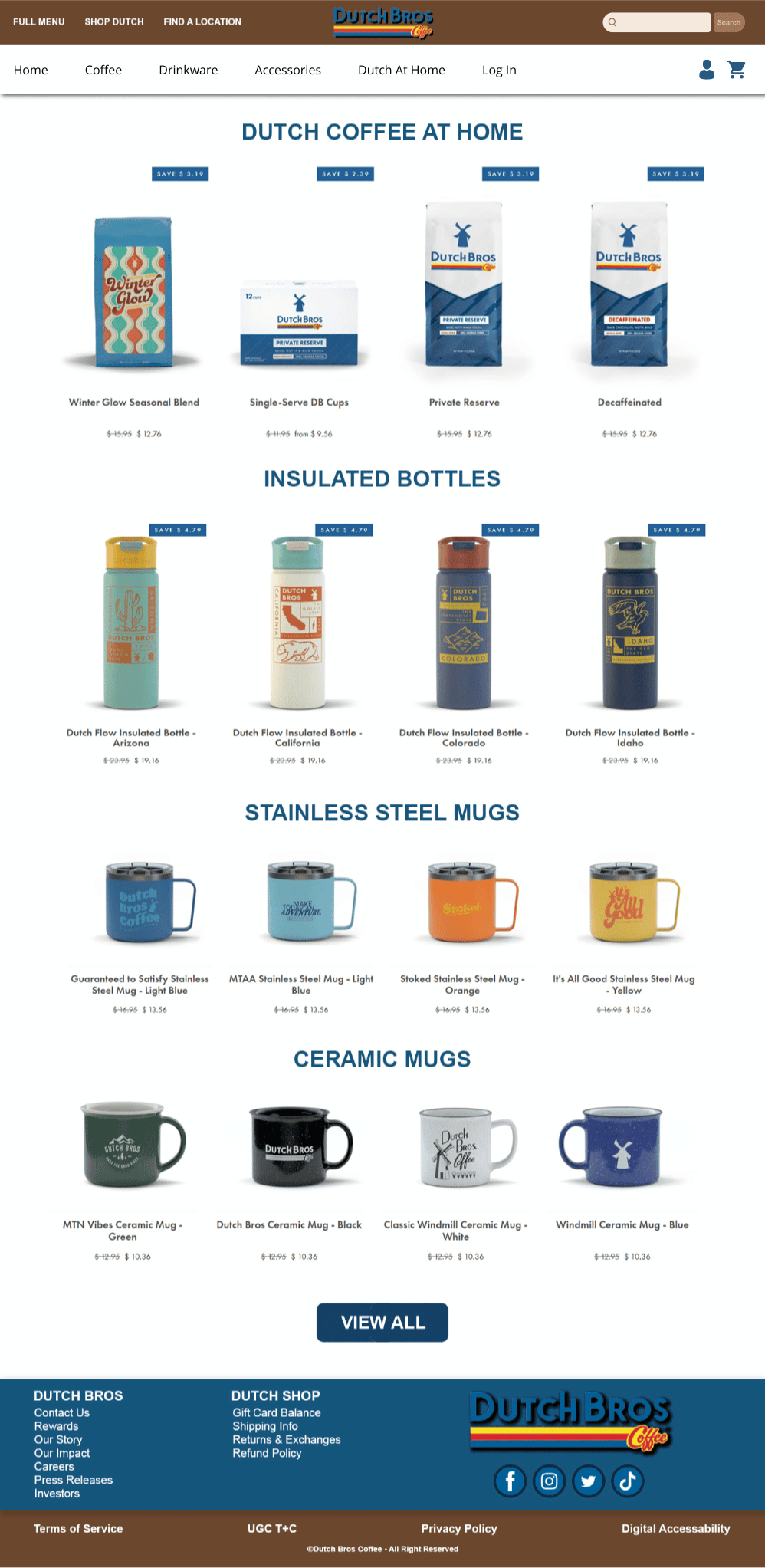
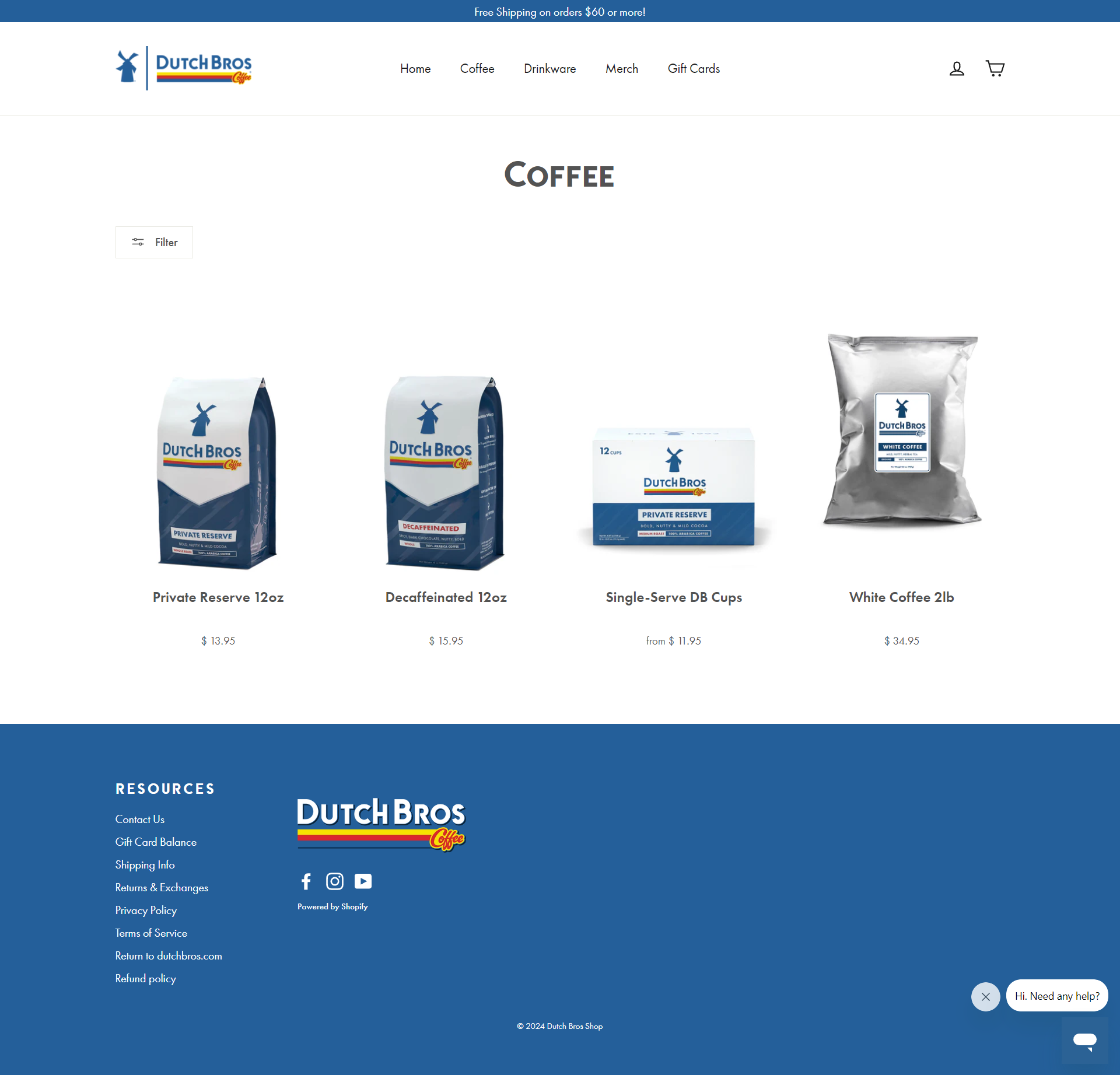
- The top and footer navigation designs of the 'Shopping' page are confusing, which makes it difficult for users to navigate back to the main Dutch Bros website
Recommendations for improvement:
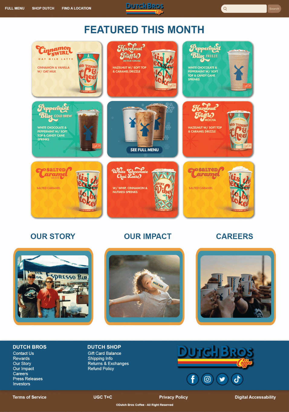
- Redesign the top navigation by replacing the background color from a generic white to a brand characteristic brown, modifying the links on the left, and removing the icons on the right to have a more streamlined main navigation
- Add a search bar in the top navigation to improve user experience, engagement, and accessibility
- Implement filters in the 'Menu' page so users can refine their search results
- List prices for all drinks to show users company transparency, and to help potential clients in a budget to plan ahead for their drink
- Combine the Dutch Bros website's footer navigation and the Dutch Bros Shop's footer navigation so users can easily navigate from one site to the other
Final Designs
Homepage
One of the main issues on the homepage was finding the Full Menu button. I designed a new Homepage where the Full Menu button is visible in the “above the fold” portion of the page by removing the autoplaying carousel with confusing links.
Menu Page
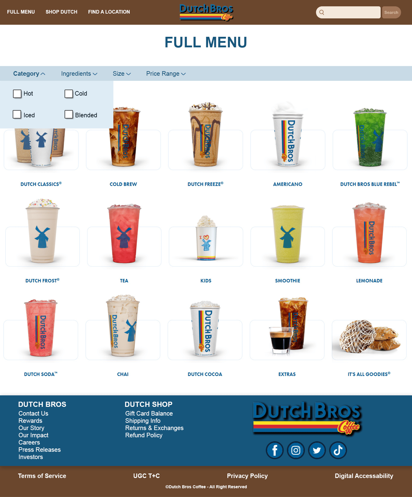
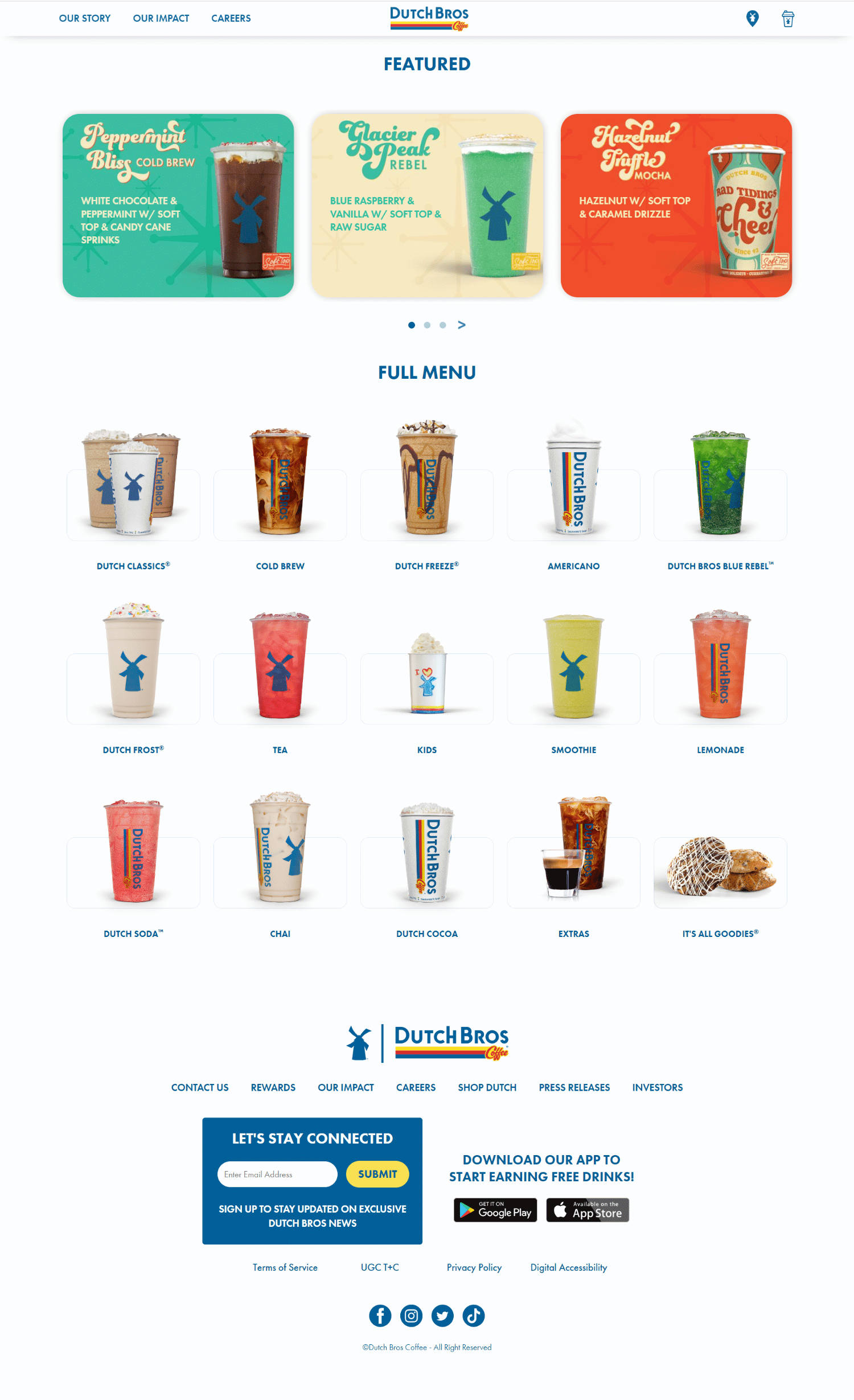
Filters were added on the Menu Page to refine the searches and get specific results in return.
Given that Dutch Bros offers a wide variety of drinks, I added the following filters and their corresponding options to choose from:
- Category: Hot, Cold, Iced, Blended
- Ingredients: Vanilla, Chocolate, Strawberry, Caramel, Kiwi, White Chocolate, Dark Chocolate, Pecan, Cinnamon, Macadamia,
Irish Cream, Coconut, etc.
- Size: Small (16 Oz.), Medium (24 Oz.), Large (32 Oz.)
- Price Range: Below $4, $4-$6, $7 and above
Drink Page
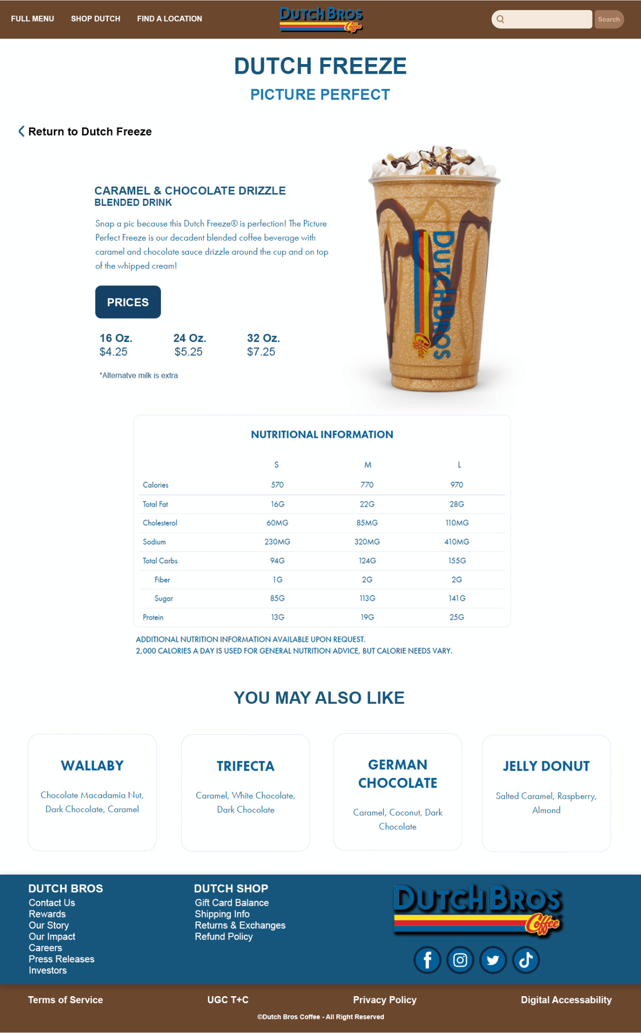
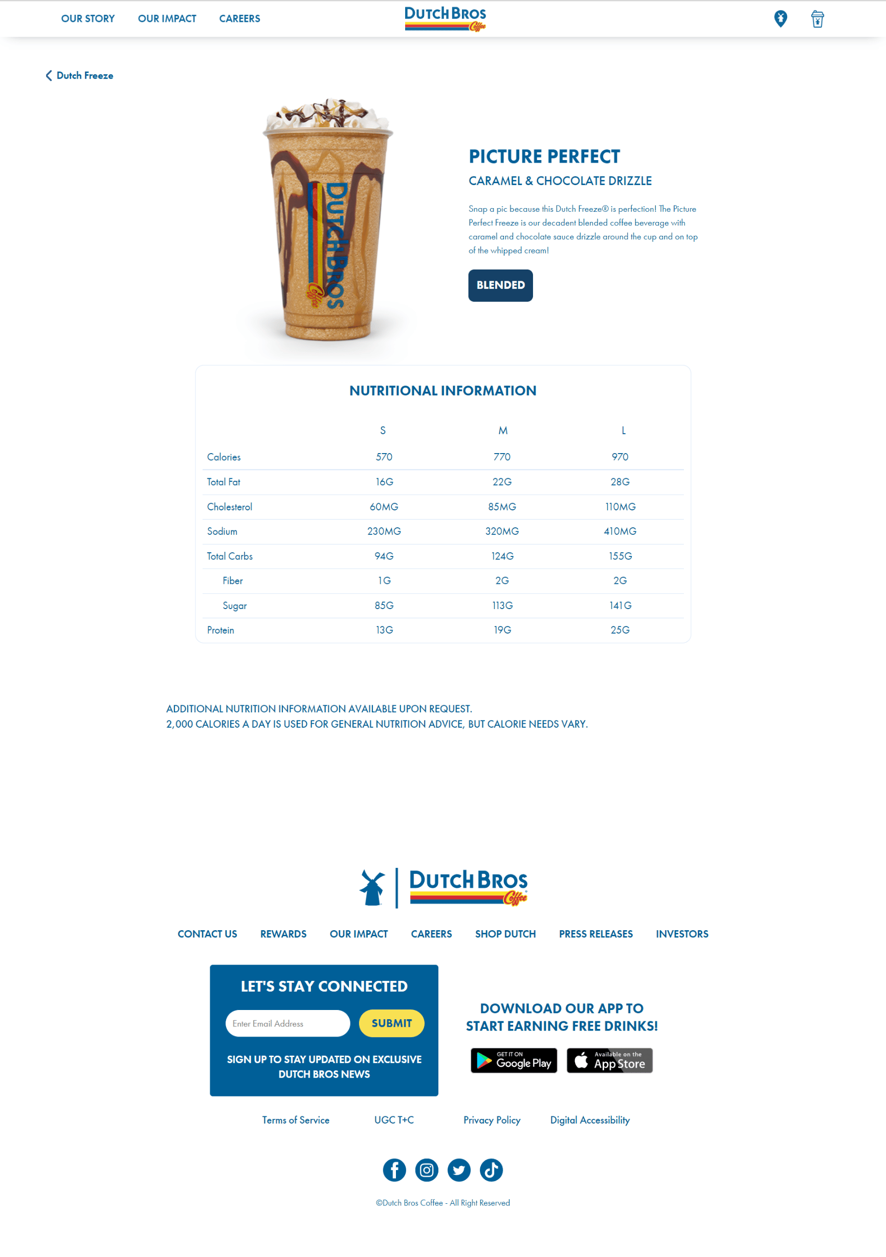
This design is specifically for the drinks in each category. I redesigned by adding prices for the three different sizes of each drink. I also added a few recommended drinks based on the current selection the user made.
Shop Page
For the Shop page, I combined both the Dutch Bros website's navigation and the Dutch Bros Shop website's navigation in order for both sites to share the same top navigation and footer. A secondary navigation was added to include all the links needed to navigate the shop.
